 Countdown to Breakout is a 23-day blog series about the three-year writing process for BREAKOUT, which earned starred reviews from both School Library Journal and Publishers Weekly. It’s about a small-town prison break and manhunt that change the way three kids see their neighbors and the place they call home. Why a 23-day series? Because this book was inspired by the 2015 Clinton Correctional Facility prison break that led to a 23-day manhunt in June of 2015.
Design Notes and Covers
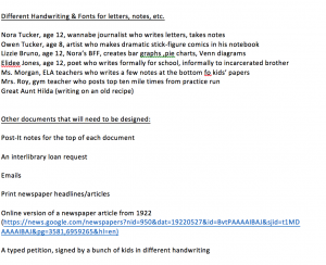
Usually, when I write a novel, I don’t need to worry much about design notes. Laying out the chapters in a book with a traditional narrative structure is relatively simple, but that wasn’t the case with BREAKOUT because the entire novel is made up of different kinds of documents. There were letters, written by different characters who needed different handwriting styles. There were news reports, petitions, recipes, and text messages, all of which had to be formatted differently. There was art, including multiple pages of graphic novel panels that Nora’s little brother Owen draws as he’s dealing with his fears over the prison break. And that required a detailed design memo. More than one, actually. Here’s a page of the first-draft design memo that I sent the team at the beginning of the design process.
(Spoiler alert: If you haven’t read BREAKOUT yet, don’t go to that website listed on the design note!)
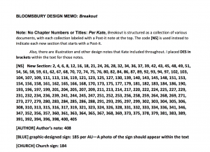
As the Bloomsbury team began to work on designing this book, they realized that there was a need for even more detailed notes and created additional design memos like this one.
The team went to work, and then there were multiple reviews of the designed manuscript, with more proofreading. We call this step in the process reviewing “first pass pages” and “second pass pages” and so on…until every detail is right and the final draft can be sent to the printer.
And of course, every book needs a cover. I’m incredibly grateful that Bloomsbury hired artist Christopher Silas Neal to do the art for this one. Chris is the illustrator for several of my picture books with Chronicle and designed some other book covers that I really, really love.
Chris started the cover design process with sketches of different possibilities, and then a rough draft of one idea.
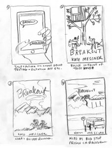
We all loved the look of this cover, but there was a concern that people might think the girls running were the escaped inmates when really, that’s meant to represent a relay-race element of the story. Bloomsbury asked Chris for another draft, keeping the overall feel of the cover but perhaps doing more with light and action that doesn’t involve the girls running or the prison.
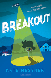
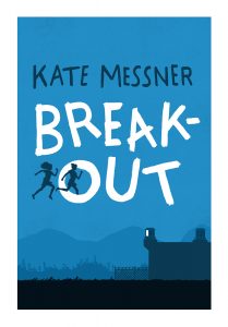
And here’s a fun secret about this cover…. Authors and cover artists don’t usually collaborate like this, but Chris and I found ourselves on the same shuttle bus at the wonderful Gaithersburg Book Festival while all of this going on, so we spent our 15-minute ride back from the author reception tossing around ideas. Could we maybe use the tree fort as an image? What if there was a police helicopter? With a search light beaming down from it?! Here’s the final cover.
One last writing assignment for today: If you could design a cover for the book you’re writing right now – or redesign one for your favorite novel – what would it look like?
Thanks for joining me on this part of the Breakout writing-process journey! If you’d like to read the other posts in this series once they’re all posted, you can find them here.
Buy BREAKOUT now:
- IndieBound (find a local bookseller near you!)
- The Bookstore Plus, Lake Placid, NY
- Powells
- Barnes and Noble
- Amazon
This has been a wonderful blog to read. I learned so much. Thank you for taking the time to do this. Best wishes with the book.
Thanks for the shout out for GBF! You are always welcome back!